Why Mobile-First Design Matters for Smart Home Control
Discover why Stuga's mobile-first approach delivers a better smart home experience than desktop-focused dashboards like Lovelace.
Think about how you actually use your smart home. When was the last time you sat down at a computer to turn off the living room lights? Probably never. Smart home control happens on your phone, often while walking through your house, one-handed, without looking at the screen.
Yet most Home Assistant dashboards are designed for desktop browsers first, with mobile as an afterthought. This creates frustrating experiences: tiny buttons, cramped layouts, and interactions that don't work well with touch.
Stuga takes the opposite approach. Every design decision starts with the question: "How does this feel on a phone?"
The Problem with Desktop-First Design
Home Assistant's default Lovelace dashboard is incredibly powerful. You can create complex layouts with multiple columns, detailed charts, and intricate automations. But that power comes at a cost when viewed on mobile devices:
- Small tap targets: Buttons designed for mouse precision are too small for fingers
- Multi-column layouts: Beautiful on desktop, cramped on phone screens
- Hover interactions: Don't exist on touchscreens
- Complex navigation: Works with a mouse, frustrating with thumbs
You can customize Lovelace for mobile, but it requires significant effort. Conditional cards, custom button sizes, separate mobile views. Many users give up and just live with the compromised experience.
Designing for Touch First
Mobile-first design isn't just about making things bigger. It's about understanding how people interact with touchscreens and designing specifically for those interactions.
Thumb-Friendly Tap Targets
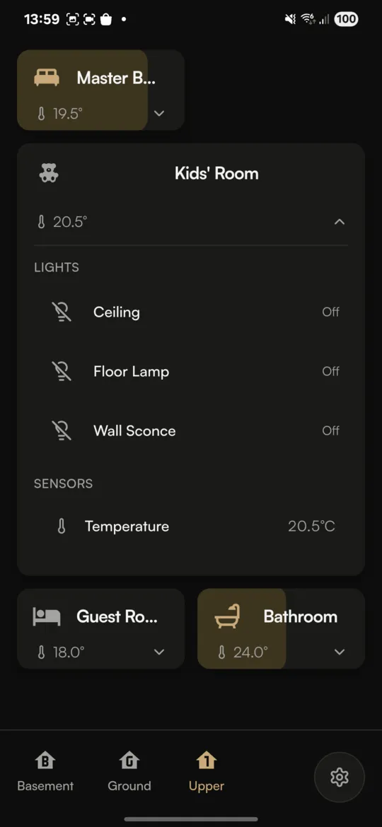
Apple's Human Interface Guidelines recommend a minimum tap target of 44x44 points. Stuga exceeds this everywhere. Room cards are generously sized for easy one-handed use, even when you're in a hurry.
More importantly, the most common actions are positioned where your thumb naturally rests. Toggle a room's lights with a single tap, right in the middle of the screen, without awkward reaching.
Swipe-Based Navigation
Desktop interfaces rely on clicking navigation menus. Mobile users expect to swipe. Stuga embraces this:
- Swipe between floors: Navigate your home with natural gestures
- Swipe to dismiss: Close dialogs, dropdowns, and pickers with a flick
- Pull-to-refresh: Update your dashboard with a familiar gesture
Context Over Configuration
Desktop dashboards often show everything at once, letting you scan and click what you need. On mobile, screen space is precious. Stuga uses progressive disclosure: you see your rooms first, then tap to see devices, then tap to access detailed controls.
This isn't limiting; it's clarifying. You're never overwhelmed with options, and you can always get to what you need in just a few taps.
Real-Time Feedback Matters More on Mobile
When you tap a button on your phone, you expect immediate feedback. A desktop user might wait a moment for a page to reload. A mobile user will tap again, assuming the first tap didn't register.
Stuga uses WebSocket connections for instant updates. When you tap a light, you see it change immediately in the app, typically within 100 milliseconds. The satisfying instant response makes the app feel reliable and responsive.
This also means you see changes from other sources instantly. If someone turns on a light from Home Assistant or another app, your Stuga dashboard updates in real-time.
The "Walking Through Your House" Test
Here's a practical test for any smart home interface: can you use it while walking through your house?
Picture this scenario: you're heading upstairs to bed. As you walk, you want to turn off the kitchen lights, check that the garage door is closed, and turn on the bedroom lamp. With a well-designed mobile interface, this should be quick and intuitive, done without breaking stride.
With Stuga:
- Glance at the kitchen room card, tap to turn off lights
- Swipe to see the garage, confirm the door status
- Swipe to bedroom floor, tap to turn on the lamp
All done in seconds, with large tap targets that you can hit without precise aim, using just your thumb.
Multi-Room Control for Common Scenarios
Another insight from mobile-first thinking: what actions do people actually want to perform? One of the most common is controlling multiple rooms at once.
"Turn off all the downstairs lights." "Dim the living room and dining room for movie night." "Turn everything off, I'm going to bed."
Stuga's multi-select feature was designed specifically for these scenarios. Long-press a room, tap additional rooms to select them, and control them all at once with the bottom control bar. It's faster than going room by room, and it's designed for touch interaction.
Scandinavian Minimal Aesthetic
Mobile-first isn't just about functionality. It's also about visual design that works on smaller screens.
Many dashboard interfaces are visually busy: icons, labels, status indicators, badges, borders everywhere. On a phone, this visual noise becomes overwhelming.
Stuga follows Scandinavian design principles: generous whitespace, restrained color use, and clear visual hierarchy. The warm color palette with brass accents feels distinctive without being distracting. Every element has a purpose.
The result is an interface that's pleasant to look at on a small screen, where your eye immediately finds what it needs without hunting through visual clutter.
When Desktop-First Makes Sense
To be fair, there are scenarios where desktop-focused dashboards excel:
- Wall-mounted tablets: A dedicated home control panel might benefit from information-dense layouts
- Complex monitoring: Energy graphs, detailed sensor history, automation debugging
- Initial setup: Configuring your smart home is easier on a bigger screen
Stuga doesn't try to replace these use cases. It focuses on being the best phone experience for daily smart home control. For complex configuration, Home Assistant's web interface is still the right tool.
The Native App Advantage
Stuga isn't just a responsive website. It's a native app built with Capacitor for iOS and Android. This provides advantages that web-only solutions can't match:
- Local network access: Connect directly to your Home Assistant without exposing it to the internet
- Secure credential storage: Tokens stored in iOS Keychain or Android KeyStore
- Better performance: Native components and optimized rendering
- Home screen integration: Launch directly to your dashboard
Many Home Assistant users keep their installation local-only for security and privacy. Native apps can connect to these setups directly, while browser-based solutions require HTTPS (and often Nabu Casa or a reverse proxy).
Try It Yourself
The best way to understand mobile-first design is to experience it. Download Stuga and spend a few days using it for your daily smart home control. Notice how interactions feel natural, how you can control your home without thinking about the interface.
Then compare it to your current dashboard on mobile. The difference in everyday usability becomes clear quickly.
Stuga is available now on Google Play and the App Store. You can also try the web version if you have HTTPS access to your Home Assistant.